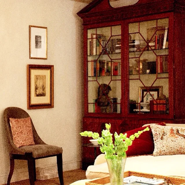
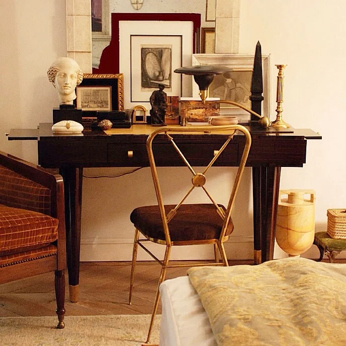
Right down to the studs! A lot of work to be done in this client's old house but I think it's going to be amazing when it's done! #LoveMyProjects #VeryCoolClients
- xo, Raji
Interior Projects
Right down to the studs! A lot of work to be done in this client's old house but I think it's going to be amazing when it's done! #LoveMyProjects #VeryCoolClients
- xo, Raji
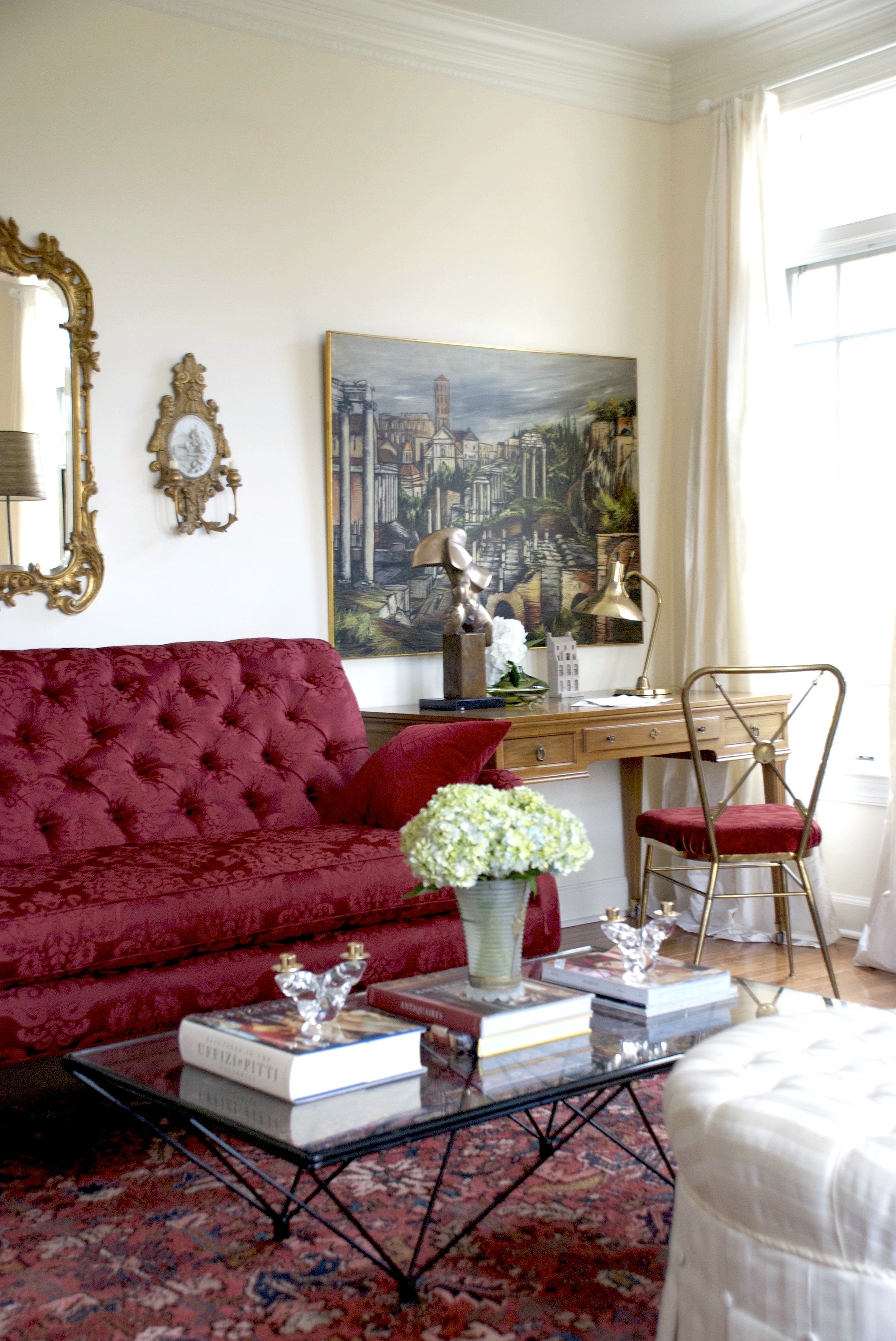
Classicism meets Modernism - This is one of the first paintings (of Grecian columns in ruins) I ever bought at auction and that architectural model is that of Sir John Soane's home in London. Both sitting pretty with a modern cubist style bronze sculpture and a brass mid-century Tempestini desk lamp. Tiny white roses from my garden.
#PatternOnPattern - fabrics mixed together and some #color thrown in for good measure! #TBT Detail of a room I designed at the 2011 Hamptons Designer Show House
- xo Raji

Design by Raji RM
Yes, the spotlight on the #flowers was intentional #TradChic

#Design by #RajiRM
For my love of #ArtDeco #Classicism and #Modernism
- xo Raji

Design by Raji RM
A few months ago I started on a project for a client whose daughter lives in New York and knew my work. When her mother bought an apartment in the lovely neighborhood of Kalorama in Washington DC, it was she who suggested to her mother that she call me. This is a contemporary apartment of a world traveler who has collected art over the years from around the globe. The client is a smart, sophisticated and caring person and I am very happy to have met her. Her apartment needed to suit her needs, her dreams. The goal was to create a sophisticated home with furnishings that worked well with the contemporary architecture and form a fine backdrop for her collection of global antiquities and modern art. For me, it was very important that the design & art meld and complement one another in a seamless fashion - one should pick up where the other left off. I also decided that because the art was significant and high in personality, the design needed to be fairly quiet and in keeping with the modern nature of the architecture. This meant that mixing traditional pieces with modern and contemporary furniture needed to be kept to a minimum.
In my own home (which is an amalgamation of Georgian and modern architecture) I have mixed a lot of contemporary, modern and traditional pieces together but I've always believed that the extent to which one can mix styles in furnishings has a lot to do with the architecture of the space and the inherent tastes or collections of the clients. This one is through and through a contemporary apartment. However, the client's collection of art ranges from modern art to 17th - 18th century Indian, Mexican, Japanese and Javanese sculptures. How do you bridge the gap? If I had added traditional furnishings it would not only be against the grain of the architecture but also very confusing and clashing with too many stories floating around. Thus, the key was to offer restraint and transition the antiquities gently into the modern world. Connect the dots, fill in for gaps in a sensible way. I thought of Christopher Columbus and I imagined taking a new route today starting in Asia, passing through Western Europe and eventually landing in America. The lynchpin being Western Europe, the missing part of the puzzle. As it happens the client expressed great interest in my murals. But I couldn't use just any mural. So the search began for European art that could work as a beautiful mural and backdrop for the antiquities while poised perfectly against the contemporary background. And it wasn't just the murals. The plan called for a slightly minimalist approach. That meant every piece of furniture had to have a reason for existence. Not just functionally but in the story I was weaving. French and Scandinavian modernist furnishings helped with that. Aesthetically, the design still needed some semblance of the old interpreted in a contemporary way and I couldn't think of better materials than brass and bronze which age beautifully and have that warm glow - this time in the form of modern tables and lamps.
As we completed the installation, I thought of my client and imagined her family gathering around for the holidays, talking about their own stories and I smiled as I bid adieu to my team and hurried back home...
Wishing you and yours a Warm & Happy Holidays!
- xo Raji
p.s. photos of the completed project coming soon!
All photos via our Instagram posts.
Isn't it amazing that in a day and age when we are all bombarded with images from Pinterest, Instagram, Facebook, Twitter and countless number of magazines, books, web sites and blogs, some images are just unforgettable?! They are so timeless that they stop you in your tracks again and again even years after they were originally shot. I was googling the other day searching for a Christian Lacroix bracelet I have and which needed some repairs. Browsing through images, I came across the first image below and it stopped me once again in my tracks as I fondly remembered the spread in the September 2007 issue of Vogue produced by Grace Coddington, shot by the uber talented photographer, David Sims and of course of the versatile Brazilian model, Raquel Zimmermann. Like for many, these images rocked my world for a long time and I still have these pages dogeared, tucked in my image screen, saved in my computer and on my phone.
Not even all of Vogue's spreads capture one's attention and hold it for years after like this spread did and still does! Everything about it - the rooms' setting, the model, the couture dresses, the hats, the hair, the make-up, the photography - the whole orchestration is magical. Being an interior designer of course, I noted the hand painted and gilded paneling and jib doors, the ormolu-like carved and gilded details of the architraves and it's variations in the blue room, the gorgeous and billowing curtain fabric with it's large floral medallions, a perfect complement to the walls and the Louis XIV & XV furnishings that are to die for!
So much so that these images influenced my design for a project I had loads of fun with! Particularly the first image where Raquel is wearing one of the most beautiful dresses by Christian Lacroix. The mulberry, plum and blueberry hues are shot through with the sharp velvet black hat, the fox sleeves and lacy chartreuse chiffon neck line all together poised in front of the complex creamy background. I loved it so much that I had to redraw the dress in the background of the room I created! The second image with John Galliano's champagne silk-taffeta embroidered with pearls jacket over a white tulle skirt for Christian Dior inspired another room I designed. Obviously they are not literal translations and aren't quite comparable. But, they are nevertheless inspired (and much more simplified) modern color stories I was happy to work with. And, I'm sure it's not the last time they will move me. As I say, il est tout ma tasse de thé!
Check back soon for Part 2 of this post - a step-by-step on how to design a room like a couture dress!

Interior Design by Raji RM & Associates

Image on left from Vogue and the Raji RM interior photo at right by Rikki Snyder

Interior Design by Raji RM & Associates
Raji RM & Associates | Interior Designer & Decorator
Washington DC | New York
Contact us to learn more about our work
We are so pleased that even after two years of Raji's debut at the Kips Bay Show House, New York, her room still receives kudos from the press and the industry. In The Washington Post's Home section today be sure to see Raji's discussion about home, design and her 2012 #KipsBayShowHouse room!

Photography by Rikki Snyder
The full view of the #homeoffice Raji designed for her muse and chief #curator of The Metropolitan Museum of Art, New York. Photography by Marco Ricca.
Raji RM & Associates | Interior Designer & Decorator
Washington DC | New York
Contact us to learn more about our work
Enfilade: an interconnected group of rooms arranged usually in a row with each room opening into the next - Merriam-Webster
Design by Raji RM & Associates
I was eleven years old when I first traveled around Europe for my classical dance performances. Visiting some of the greatest cities - London, Wales, Paris, Berlin, Amsterdam et al and usually the day after a performance, I was whisked away by the families and friends who were our hosts and given a tour of the city. These tours often included some of the local palaces and gardens. Although I couldn't understand the significance then or appreciate the full history and architecture of the places I visited, I do remember feeling an awe at the grandeur and ornamentation and particularly remember enjoying the vast spaces and the room after room after room that I could see through in one length and run back and forth to the dismay of my parents. Little did I know the important architectural concept that would in many ways quite literally shape my life.
Design by Raji RM & Associates
In my early twenties, one of the first words I learnt in architecture and design and still love is - the enfilade. Wikipedia has a nice definition of it - in architecture, an enfilade is a suite of rooms formally aligned with each other. This was a common feature in grand European architecture from the Baroque period onward, although there are earlier examples, such as the Vatican stanze. The doors entering each room are aligned with the doors of the connecting rooms along a single axis, providing a vista through the entire suite of rooms. The enfilade may be used as a processional route and is a common arrangement in museums and art galleries, as it facilitates the movement of large numbers of people through a building.
I for one could not wait to create an enfilade in my own home (see photos above) which I finally did last year. Need I say il est juste ma tasse de thé?!
See more of Raji's home here and here.
Raji RM & Associates | Interior Designer & Decorator
Washington DC | New York
Contact us to learn more about our work
It's no secret that I love all things French particularly the French Modern period between the 1920s - 1970s. Architecturally though, I'm more of a classicist. The juxtaposition of French Modern pieces against a classical background is a great complement to both these styles as you can see in my own home here. I am also a huge fan of English Architecture & Design. Sir Edwin Lutyens and Sir John Soane inspire me endlessly. And, English country I think is one of the most charmed way of living and it does not necessarily have to be grand. Take the Cotswolds - quiet streets lined with little cottages made of mud and centuries old stones, preserved, transporting you to a different period, a different era.
While visiting a new client a few years ago, Cotswolds was exactly what I was thinking about driving up the street lined with homes that looked like they came straight out of the pages of a story book. And, as I walked through the door, the character of the rooms simply confirmed my initial feeling. And I thought - il est tout ma tasse de thé!
Design by Raji RM & Associates
Design by Raji RM & Associates
Design by Raji RM & Associates
Design by Raji RM & Associates
For more project photos click here.
Raji RM & Associates | Interior Designer & Decorator
Washington DC | New York
Contact us to learn more about our work